You have just 10 seconds to leave an impression on website visitors; otherwise, they will leave. Can you imagine how to make these 10 seconds influential for the desired response from site users? With a stunning web design, it is possible to grab the attention of visitors in the first few seconds, which will make them look for more. To attract users, present what they want, so considering the popular web designing trends in website building is integral for the desired response from the target audience. Before moving towards the main topic of popular web design trends of 2015, know some interesting stats.
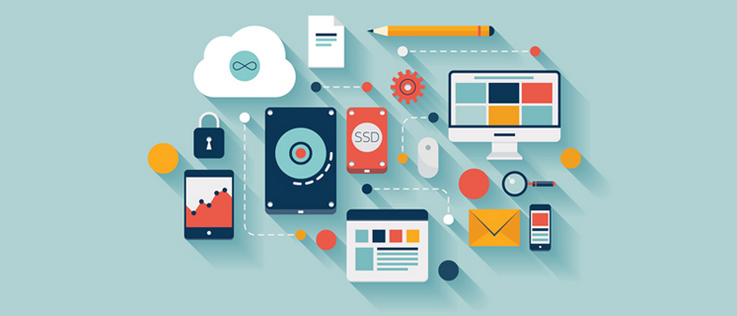
 There are free code libraries, open source plugins available for improbable documentation, and jQuery making website development even easier for a newbie web designer. jQuery is, so far, the most efficient way to create stunning media galleries for a website. There will be more techniques to help adding media galleries to a website in near future just this media gallery extension for Magento.
- 40% website visitors leave the site if it takes more than 3 seconds to load. (Econsultancy)
- 70% people see bullets at first compared to 55% who read points without bullets.(Ironpaper)
- F-shape is a common website scanning pattern by users. (nngroup)
- Dark colors work better than light colors in terms of ...
- More website traffic (2% : 1.31%)
- More page views (2.98 : 2.91)
- Average time spent on website (3.18 sec : 3.15 sec) (visual.ly)
- 88% users do not return at a website if they had a bad experience.(Econsultancy)
Ghost Buttons
Such buttons are becoming popular among web designing community. Resembling with flat UI design patterns, ghost buttons are transparent and light up when a user hovers over. These are usually boxes having colored borders, round corners, or text carrying extra padding. Ghost button can be used for the action that is not desired at first, like if a website is offering free trial of a software and there is purchase option as well, a ghost button can be used for free trial whereas a colored button can be used for purchase option. These buttons are perfect for minimal or flat layouts and can help creating brilliance. Here is the list 25 inspiring websites using ghost buttonsIcons Presenting Features
Many startups use graphics to present their services or features. Mobile apps and creative websites are also using this approach to present the main features. One best example is life360.com. Icons are used to communicate the visual meaning of the features listed in text form, hence a more appealing approach for better understanding. Have a glimpse of silverpush.co. Other than features, these icons could be used to explain actions or how the customer will be benefited from the purchase. There is more to explore about using icon featured lists for multiple purposes.Unique Digital Media Galleries
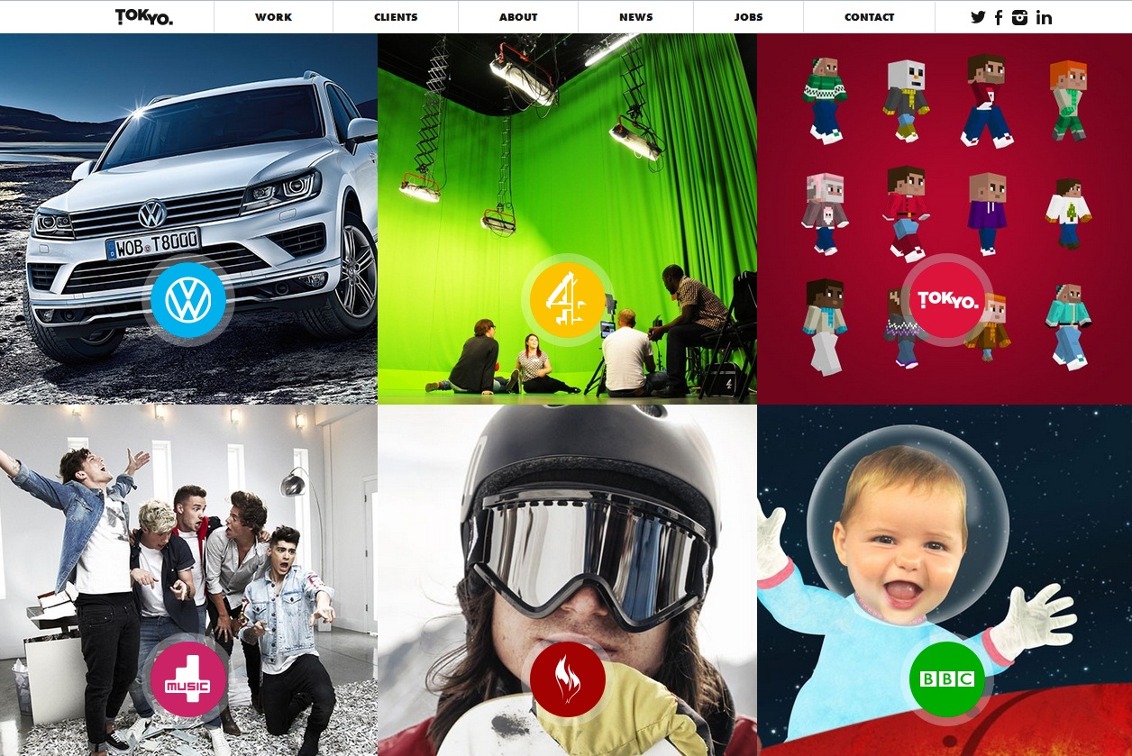
It is no more difficult to include image galleries and slideshows on any screen size, but staying unique is what web designers should think about. Full screen slide show having a relevant background photo gives a clean and smooth feel to the homepage of a website. The best example is that of Tokyo.uk. Users expect digital media to be part of any website, so designers should think about incorporating it into the website design in the most effective manner.
There are free code libraries, open source plugins available for improbable documentation, and jQuery making website development even easier for a newbie web designer. jQuery is, so far, the most efficient way to create stunning media galleries for a website. There will be more techniques to help adding media galleries to a website in near future just this media gallery extension for Magento.
Parallax Layout For Storytelling
Parallax design is already in trend due to the creativity and attractive presentation. Website development experts are also working on amazing parallax plugins to help web designers. The main theme of parallax designs is storytelling. Every website has something to tell, a business story or success story; parallax layout can help that purpose in an effective manner. A single page can have graphics, animations, and text, and all this does not need heavy loading. Powerful content is integral to make parallax layout influential. Great content can be broken down into different sections, though being on a single page. Look at akita.co Parallax storytelling trend is easy to follow, so use that for your website’s success.Fixed Navigation Bars
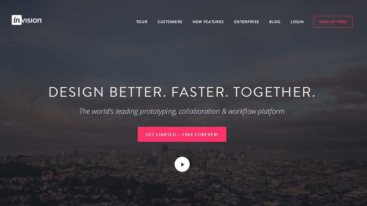
Website designing trends come again and again; one of those is fixed headers. The new technique used for these fixed headers is blending navigation into it, which stays at top of any website. When a visitor visits a website, the navigation menu appears as header, when he scrolls down, the navigation menu becomes fixed at the top. One best example is invisionapp and GO-Gulf. Some web designers consider this technique as space consuming, but from users’ point of view, it works well because they want to access navigation menu wherever they are at the page. To make fixed navigation bar appealing, use little animation and slide down effect working with scrolling.